Equity valuations are having an Icarus moment. For more than
a decade, the cost of capital fell. The post GFC
dis-inflation or the lack of inflation meant central banks
kept bringing down rates, even to negative territories in
certain markets. Central banks also pumped significant
liquidity into markets, especially in the wake of the
pandemic, which depressed yields even more (Chart 1).
Chart 1: Global M2 YoY growth and US Treasury yields (as a
proxy for global bond yields)
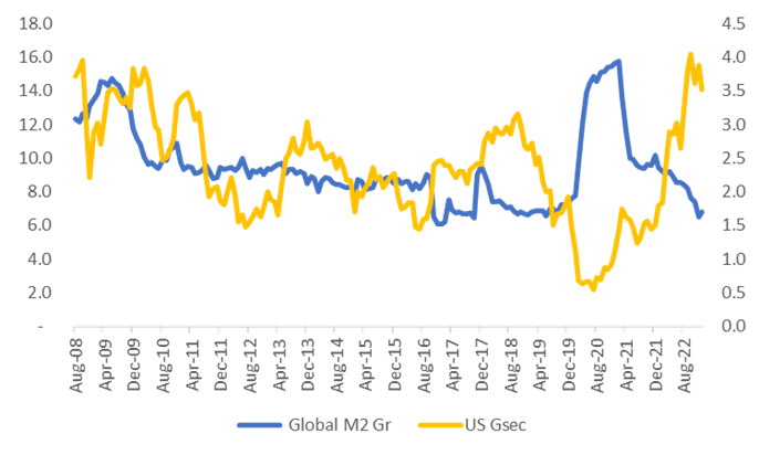 Source: SBIFM Research
Cheap and abundant money became the ultimate stimulant for
risky assets. Markets disregarded all concerns on inflation
or yields. QE became the new normal as the beast of
inflation had been tamed, or so it was believed.
The heady rise in inflation in the last 12-18 months is
breaking the back of ever-rising p/e’s. Monetary policy
moves to counter rising inflation have spiked bond yields,
and thus, as a corollary the cost of equity. The Orcus of
inflation is merrily slashing away the excesses of the last
decade.
The average P/E of ~BSE200 companies (curated for outliers)
has corrected from ~38x in the post pandemic rally to ~27.5x
at end of March 2023. The correction, some would argue
(especially value investors), has been long overdue.
Observed cost of equity (using the Damodaran formula and
data) for a 1 beta firm in India fell from the 16-17% to the
10-11% mark over 2010/11 to 2020/21. And is now at the 14%
mark.
Chart 2: Cost of Equity for a 1X beta firm in India
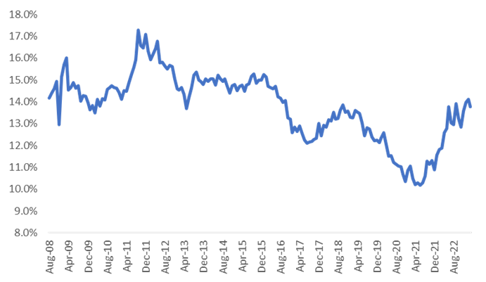 Source: SBIFM Research. Calculation is done using the
principals laid out by Prof. A. Damodaran
Source: SBIFM Research. Calculation is done using the
principals laid out by Prof. A. Damodaran
The BSE200 constituent’s curation has been done for sharp
outliers (those having ‘absurd P/Es’ such as 500-1000x, loss
making periods, etc)
If falling yields were a driver of cheaper equity capital,
the inverse should hold true as well. Yields have risen on
higher rates and a reversal of QE to QT, consequently the
cost of equity has risen. The chart below shows the degree
to which the two are directionally correlated.
Chart 3: Calculated cost of equity v/s Indian 10-year
G-Sec yield
 Source: SBIFM Research
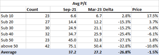
The chart below depicts the move in the avg p/e of ~BSE200
constituents (curated). Each dot represents the Avg p/e
compared to the cost of equity (at 1 beta). The red dot
represents March ‘23, The dot yellow is the peak of Sep ‘21.
It is worth noting how much it has corrected in just a year
(Purple to Red)
Chart 4: X Axis - Cost of Equity, Y Axis - Avg P/E of
~BSE200 constituents
 Source: SBIFM Research
The average P/E of the curated BSE 200 constituents has
corrected by 12.9% compared to the p/e 2 years back (Mar ‘23
v/s Mar ‘21). The most intriguing change has been the FMCG
pack, which has seen the average p/e remaining flat. The
Industrial Pack has seen a 5.5% increase, which is not
surprising given the increased investor interest in the
potential for a new industrial cycle.
Table 1: Delta in P/E at the end of Mar 23 sector wise
compared to Mar 21.
|
Avg P/E delta Mar 23 v/s Mar 21
|
| Commodities |
-4.3% |
| Consumer Discretionary |
-17.9% |
| Diversified |
-45.0% |
| Energy |
-10.7% |
| Fast Moving Consumer Goods |
1.2% |
| Financial Services |
-27.0% |
| Healthcare |
-12.5% |
| Industrials |
5.5% |
| Information Technology |
-10.6% |
| Services |
-42.4% |
| Telecommunication |
-25.4% |
| Utilities |
18.7% |
| Average |
-12.9% |
Source: SBIFM Research
The delta in p/e changes is uniformly the highest for those
which rose the most. The tables below depict the delta in
avg p/e in various buckets. In table 2, there were 42 stocks
part of the BSE200 which had a p/e above 50 in Sep 21, those
stocks had an average p/e of 75x which has corrected by
~33%. In contrast in Mar of 2013 (table 3) there was only 1
stock which had a p/e above 50x.
To keep things in perspective, in the 50+ p/e bucket, for
the stock price to remain flat, earnings would have had to
grow 49% over this period. The average stock in this 50 p/e+
bucket returned ~-11%.
Table 2: Delta in P/E at the end of Feb 23 by various
buckets from the peak of Sep 21.
 Source: SBIFM Research. Arithmetic averages for price
performance and P/E
Source: SBIFM Research. Arithmetic averages for price
performance and P/E
For the universe the average stock return was -1.5% and the
p/e correction was 26.8%, essentially all earnings growth
was eaten away by the p/e compression. The chart below
decomposes the 1 year return of the Nifty from earnings and
from valuations. As can been seen, recent earnings growth
has been eaten away by the fall in valuations. Price, one
pays matters. Excessive valuations will eat into earnings
growth.
Chart 5: Nifty 1 year return decomposed by earnings factor
and valuation factor
 Source: SBIFM Research
The ten-year data (Table 3) is in some sense not surprising.
The highest average return has been from the lowest p/e
bucket of companies. These would have seen a dual impact of
rising earnings as well as rising p/e’s.
Table 3: Delta in P/E at the end of Mar 23 by various
buckets from the peak of Mar 13
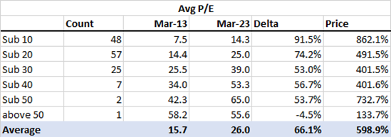 Source: SBIFM Research. Arithmetic averages for price
performance and P/E
Source: SBIFM Research. Arithmetic averages for price
performance and P/E
So what lies ahead? The normalized bell curve for
p/e’s (chart 6) shows a narrowing of the std deviations and
a fall in the mean p/e (from 37.1x in Sep 21 to 27.5x in Mar
23). Still, from a 10-year perspective, average p/e’s are up
2/3rd’s. The average multiple is at 26x for a cost of equity
not so dis-similar, 13.8% in Mar 23 compared to 14.6% in Mar
13.
Chart 6: Normalized bell-curve of p/e’s across time
periods.
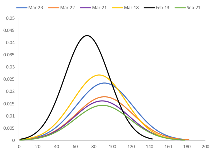 Source: SBIFM Research
This probably implies that if earnings don’t accelerate fast
enough, we run the risk of mediocre equity returns at best
or a price correction. Earnings have been supportive so far,
but the future could see turbulence with growth expected to
slow. The wings of easy money over the last decade exalted
many market participants and securities. There have been
meaningful corrections, but pockets of exuberance and
valuation excesses remain.
We may, of course, be blessed by central banks once again
with a pivot as the rate rise cycle pauses but it is far
more likely that rates will remain at a higher levels than
move back to historic lows. This means that cost of capital
will remain elevated shifting the conversation back to
earnings growth. This transition is unlikely to be smooth.
Odds are that it’ll likely be a stock pickers market and
that much harder to generate returns you were used to.
This presentation is for information purposes only and is
not an offer to sell or a solicitation to buy any mutual
fund units/securities. The views expressed herein are based
on the basis of internal data, publicly available
information & other sources believed to be reliable. Any
calculations made are approximations meant as guidelines
only, which need to be confirmed before relying on them.
These views alone are not sufficient and should not be used
for the development or implementation of an investment
strategy. It should not be construed as investment advice to
any party. All opinions and estimates included here
constitute our view as of this date and are subject to
change without notice. Neither SBI Funds Management Limited,
SBI Mutual Fund nor any person connected with it, accepts
any liability arising from the use of this information. The
recipient of this material should rely on their
investigations and take their own professional advice.
Appendix:
-
GFC =
Great Financial Crisis of 2008 which resulted in
collapse of Lehman Brothers and severely affected
several financial firms across the globe
-
QT =
Quantitative Tightening – When the central bank makes
money dearer/expensive
-
QE =
Quantitative Easing – When the central bank makes
money easier/cheaper
-
PE =
Price to Earnings Ratio – A relative measure of value
of a company
-
Orcus* -
Latin god of underworld who punishes broken
promises/oaths, used here as an analogy representing
Inflation acting like Orcus and punishing people who
committed valuation excesses in the last cycle
-
Damodaran =
Prof Aswath Damodaran of New York Stern School of
Business. His work can be accessed here:
https://pages.stern.nyu.edu/~adamodar/New_Home_Page/datafile/wacc.html


)
12e76bb30b4a4c748257d262c6e2e347)
)
)